
Add new candidate
The add new candidate form is the way for the recruiter/sourcer to add talents to the CRM in a fast and efficient manner

Overview
Phenom’s CRM system is an "all in one" tool for sourcers and recruiters.
When sourcing one of the ways to add a candidate to the CRM is the "Add new candidate" form. This form is accessible through almost every corner of the CRM and its purpose is to add the candidate into the system as easily with as much information as possible.
Role
UX Research • Wireframes
UI by Shaked Maktubi
The Problem
The original form is out of date, and its design is not compatible with the way users are using it today. In addition, there were information architecture issues in need of solving through the UX here.
In addition, there was another way of adding candidates only by uploading a CV, without having a structural method or clear process for the user, and both ways needed to be aligned and consistent.
Goals
-
Add candidates easily
-
Align & unified new flows to fix the information architecture issues
Research
When approaching the research, I had to understand how the users enjoy this feature, having FullStory Metrics and recording observations allowed me to have clearer understanding of the user behavior, in addition, I did a market analysis to understand how it's done by the competition and other CRM and used some for the basic rules of UX information hierarchy.
Discovery 1 - How to use it efficiently
The users were split into 2 groups:
-
Pro users - They already know how the form is functioning and they know that they can get ahead by uploading the CV and get it auto-filled by the CV parsing.
-
Standard users - They will use the form filling field by field and at the end (where the "Upload CV" is located) they will upload the CV

There is a faster way
Discovery 2 - Unused and disruptive feature
The "Upload resume" feature was meant to help the recruiter in adding candidates quickly and efficiently, but in practice, that feature wasn't adopted (only 0.03% of users used it), In addition, its "adding" flow is not clear, and confusing to the user as it ends without any indication of success.
Discovery 3 - Information architecture complexity
After mapping out all of the information architecture I've come to realize that there are too many types of flows merging the added candidate with the existing candidates (an existing feature) and that can cause the user even bigger confusion.

Too many flows can be too much for the user
Market Analysis
Recruit CRM is placing the resume uploading area at the top in a very exposed location that helps it be accessible, Although their field layout is inaccessible and unreadable.
HubSpot form is very clean and clear with a very straightforward layout.

Findings & Insights
Bring the tech to the front
The location of the resume upload was at the bottom of the form and it needed to be a more visible and obvious location since it's helping the user to auto-fill the form
Simplify the process
Having too many scenarios only confuses the user, It needs to be simple and serve the business goals.
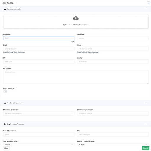
Solution
Form reorder and organize
Based on the research results, I chose to show the user the resume upload at the beginning of the form along with an explanation of the benefits of using this feature.
In addition, the form has been divided into groups of contexts to make it easy to read and fill.
Old

New

Remove unnecessary flows
Since it was causing a lot of confusion for the users and creating a discrepancy in the candidates' profiles data it was a step that I've taken to the PMs and the DEV to remove the option to merge the added candidates with the existing ones, and give the user an alternative approach to the existing candidate's profile for any changes he might need to do.

Final design
