Candidate activity
The activity tab is the place for the recruiter to see all of the candidate's activities, there for it needs to be clear and accessible.
Overview
Phenom’s CRM system is an "all in one" tool for sourcers and recruiters.
When recruiting for a job the recruiter needs to find all the information about the candidate fast and efficiently. The candidate activity tab is the place where the recruiter can find all of that, the communication with the candidate, or any activity that occurred on or by the candidate.
Role
UX Research • UI Design
The Problem
Since it is a well-established feature in the CRM, which over time has accumulated multiple entities, its original filtering method lost its ability to present the information in an efficient way to the user.
Goals
-
Direct the user to the information
-
Align all of the activities design
-
More adoption & less abandonment
Research
When approaching the research I needed to understand how the users use this feature, having FullStory Metrics and recording observations allowed me a clearer understanding of users’ behavior.
In addition, I took an inventory of how each activity is designed.
And I did a market analysis to understand how it's done by the competition and other CRM.
Discovery 1 - Filtering issues
-
The filter does not serve the user properly and causes them to abandon the section without getting information (based on FullStory observations).
-
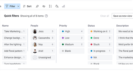
Having 14 entities in one dropdown is too many, especially since most of them can be united into main categories and that is the root of the problem.

Discovery 2 - Inconsistent design pattern
When reviewing the activities inventory, I noticed the difference between the activities' design patterns that can cause the user a lot of confusion when "reading" each type of activity.
Job's link
Discovery 3 - An unreadable design pattern
Scanning and reading the activity is challenging due to a lack of hierarchy of information
Market Analysis
Activities(cards) patterns
Active Campaign's card structure is very straightforward in its phrasing and has a very organized hierarchy.

Filters patterns
Monday's filter uses categorizing into groups with clear hierarchy that influences the other categories with every selection
Findings & Insights
Efficient filtering
Missing information due to inaccurate navigation and filtering leads to frustration and abandoning
Combine as much as possible
-
Too many categories to select from
-
By uniting the categories we narrow the "wandering" between the categories
Consistency, consistency, consistency
As mentioned before, this section was constructed layer by layer with a
lack of consistency, both in terms of the general structure of each activity and in terms of the content description of each activity
Solution
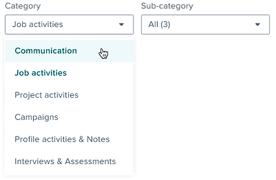
Filter category merging
Based on the research results, the initial solution was to show all activities together in one timeline, However, due to the extensive engineering effort, another UX solution was required.
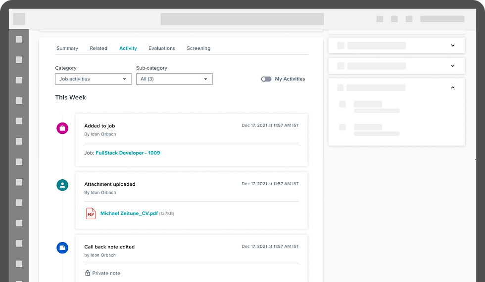
Grouping of the entities - This will reduce the user's frustration since it makes filtering easier, as there are only 6 categories to choose from instead of 14.
Old

New

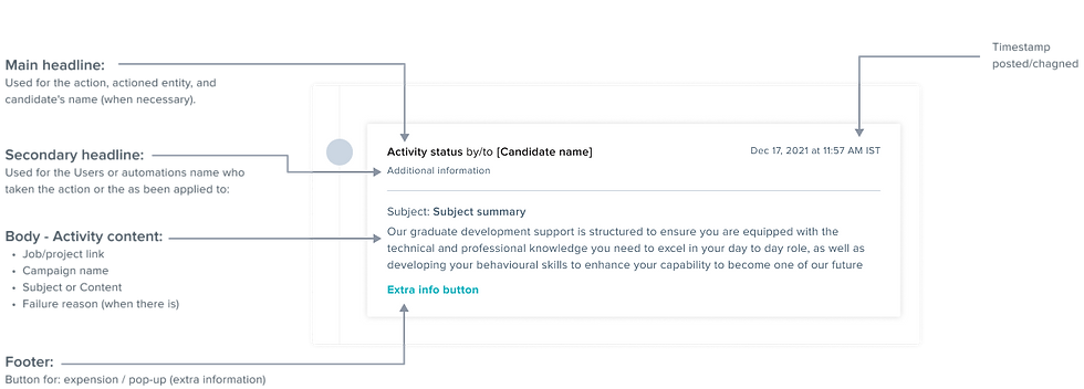
Activity card information redesign
In this section, There was a need for a unified and consistent design and structure so that the activity card could hold many types of entities and be scalable for future enhancements
The Variants
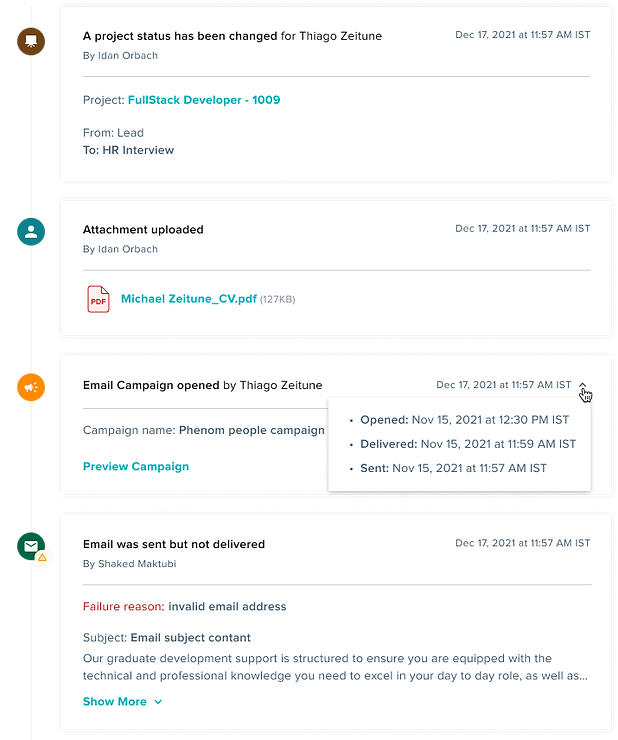
Changed status for project
Attachment added
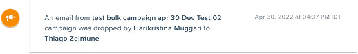
Email Campaign opened
+ Timeline
Email failure